Introducing Our New Logo
Oct 12, 2015

At the beginning of 2015, we began to feel like our existing logo was starting to look outdated and didn’t excite us as much as it used to. We wanted a change, but understood that having brand consistency and staying recognizable to our clients was essential to our business. So, instead of rolling out a completely new idea, we decided to perform a logo refresh.
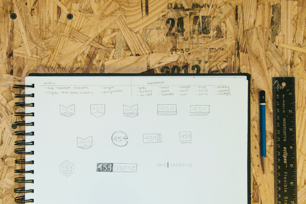
The goal of our logo refresh was to keep continuity with the old and new logo to show a natural progression of where 454 Creative is headed. We decided the key element to carry over from our old logo was the chevron shape. With that in mind, we began sketching. Check out some of our early ideas below.

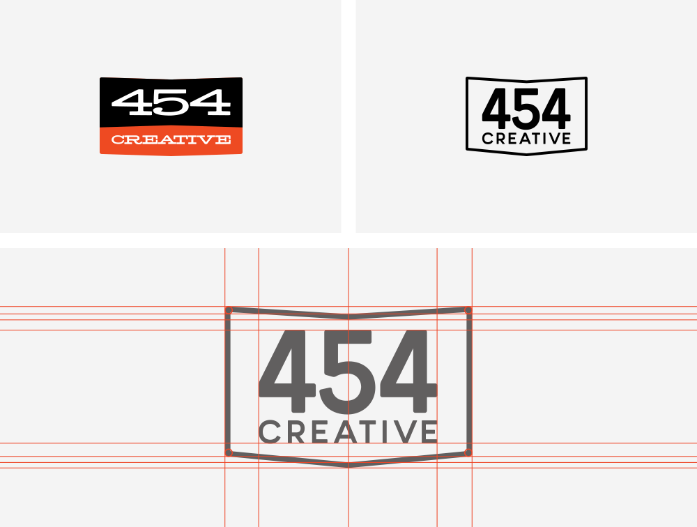
After bouncing ideas around the team, our designers began choosing a new typeface. We laid multiple ideas out in Adobe Illustrator and refined the designs until landing on our new logo. We chose Minimo as our main font for the logo. In addition, to keep our brand classic and timeless, we kept the logo black (or white depending on the circumstances) instead of the previous red and black. You can see our logo progression below.

Revamping a logo for your company can be a daunting task, but it can be useful as your company grows and design trends change. We’re not the only people who feel this way. Click here to read about Google’s recent logo update to learn how they approached the rebranding process.
Thanks to our talented design team, our final logo is clean and simple, with a nod to our past. As our company continues to evolve, it is satisfying to have a logo to match. We hope you agree.
Introducing Our New Logo by ![]() 454 Creative in Inside 454
454 Creative in Inside 454


Leave A Comment